
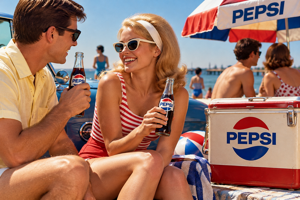
For Pepsi collectors, the three decades from the 1950s through the 1970s offer an unusually vivid record of how an American brand changed with the culture around it. Bottles, metal signs, thermometers, serving trays, vending-machine graphics, cartons, paper advertisements, and promotional pieces all preserve different stages of Pepsi’s shift from traditional soda advertising to the youth-oriented image that came to define the brand.
This is also a period when Pepsi’s visual identity changed dramatically. The flowing Pepsi-Cola script of earlier decades gradually gave way to the red, white, and blue bottle-cap motif and eventually to the cleaner, modern Pepsi designs familiar from the 1970s. For collectors, those changes make mid-century Pepsi material both visually varied and useful for roughly dating surviving pieces.
The 1950s: Pepsi Goes Mid-Century
The 1950s marked an important transition in Pepsi advertising. In 1951, the company introduced the distinctive red, white, and blue bottle-cap design that became the ancestor of the later Pepsi globe. The older Pepsi-Cola script remained visible, but it was increasingly framed within stronger, more graphic branding suited to supermarkets, roadside businesses, diners, and the rapidly expanding world of postwar consumer goods.
That makes the decade especially rich in recognizable advertising collectibles.
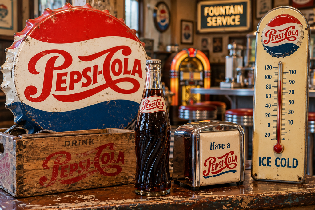
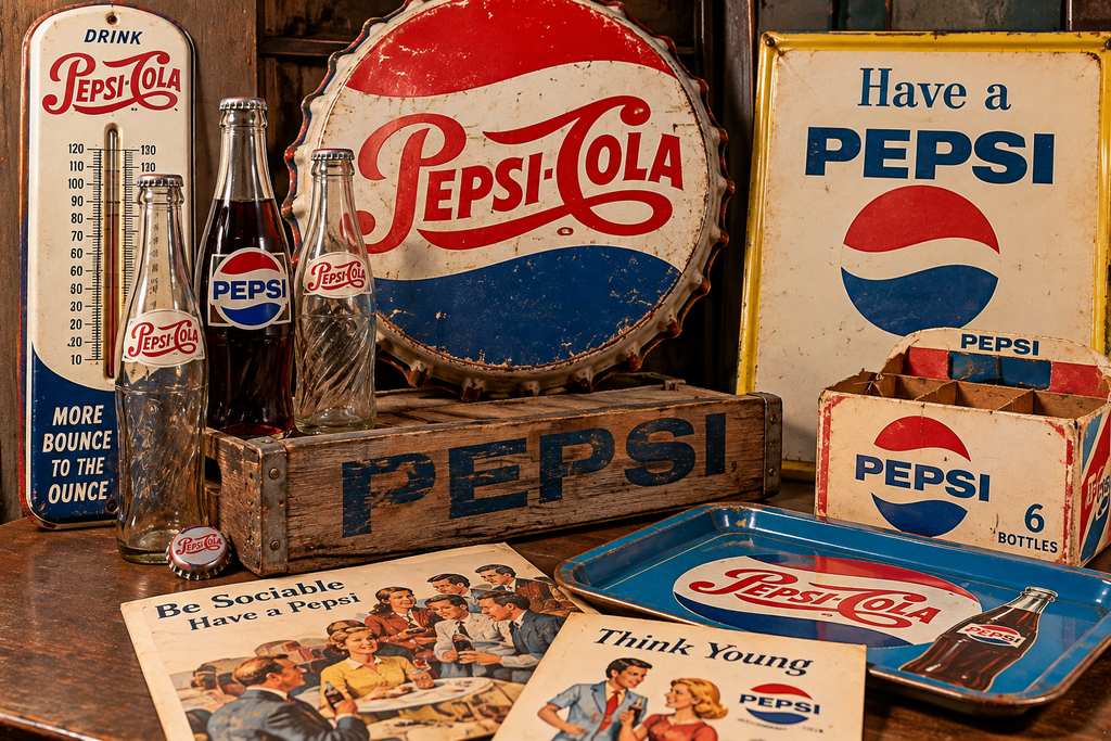
Metal signs are among the most visible survivors. Pepsi supplied retailers with wall signs, flange signs, bottle-cap-shaped displays, thermometers, and other pieces intended to be seen from sidewalks, gas stations, groceries, restaurants, and soda counters. Some combined advertising with a useful function: thermometers, clocks, menu boards, and store displays gave merchants a reason to keep the Pepsi name visible year after year.
The slogans printed on these objects can also help place them in context. Smithsonian holdings document Pepsi’s “More Bounce to the Ounce” and “The Light Refreshment” campaigns from roughly 1953 to 1958, followed by “Be Sociable” advertising beginning in the late 1950s. A circa-1959 “Be Sociable, Have a Pepsi” advertisement in the Smithsonian collection shows relaxed young adults enjoying Pepsi in recreational settings—a clear move toward selling a lifestyle as much as the drink itself.
Glass bottles are another major collecting area. Pepsi adopted a standardized “swirl” bottle in 1958, part of the broader movement away from some of the highly localized bottle designs associated with individual bottlers. Earlier and transitional bottles can therefore contain details—painted labels, embossing, bottler information, base markings, and logo variations—that make them particularly interesting for identification.
A bottle that looks ordinary at first glance can reward close inspection.
The 1960s: Selling Youth Instead of Just Soda
If 1950s Pepsi material represents postwar consumer optimism, 1960s collectibles document something different: the emergence of Pepsi as a consciously youthful brand.
The Smithsonian’s Pepsi advertising archives trace the progression clearly. “Think Young” material dates from 1961 to 1963, followed by the “Come Alive” campaign from 1963 to 1967. By the middle of the decade, advertisements were explicitly telling consumers, “Come alive! You’re in the Pepsi Generation.”
That change matters when looking at collectibles.
Earlier advertising often centered the bottle itself: here is Pepsi, here is the price, here is why you should buy it. By the 1960s, advertising increasingly placed the product within scenes of recreation, fashion, parties, travel, sports, and social life. The collectible is no longer simply evidence of how Pepsi looked. It becomes evidence of who Pepsi wanted its customers to imagine themselves becoming.
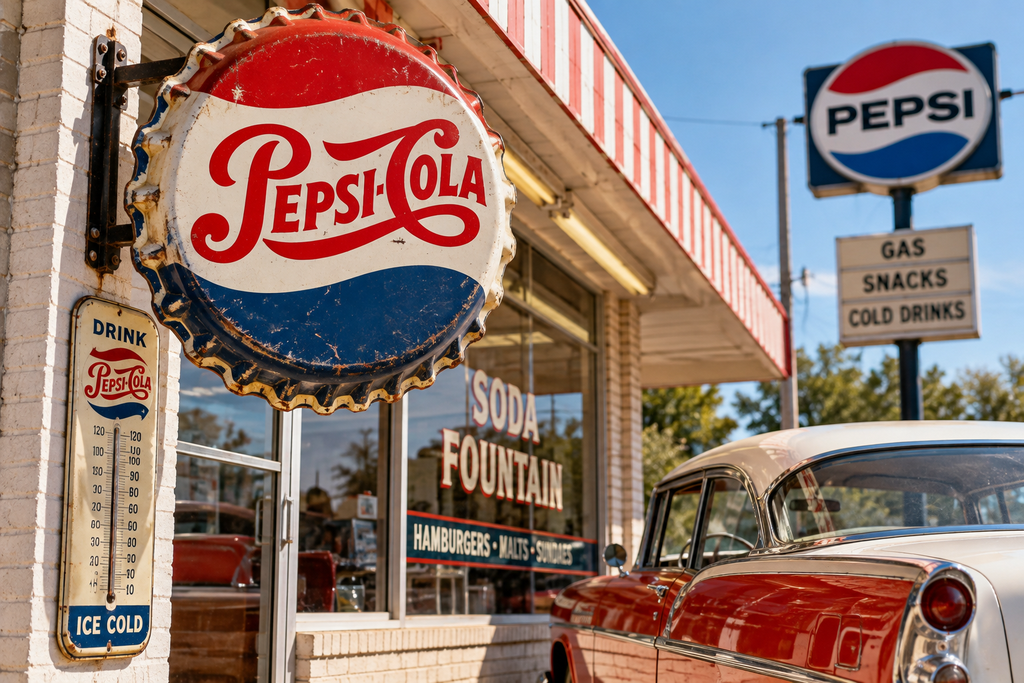
Paper advertising from this era can be especially revealing. Magazine pages, dealer displays, counter cards, decals, promotional booklets, and point-of-sale material often preserve the bright colors, clothing, hairstyles, and graphic design that made 1960s commercial art so distinctive.
Pepsi’s campaign chronology also gives collectors useful dating clues. “Taste That Beats the Others Cold,” for example, appears in Smithsonian material dated 1967 to 1969. The next major campaign, “You’ve Got a Lot to Live, Pepsi’s Got a Lot to Give,” began in 1969 and extended into the 1970s.
A slogan is therefore more than decoration. When it can be tied securely to a documented campaign, it can help narrow the period in which a sign, advertisement, or promotional piece was produced.
Bottles, Cartons, Signs, and Everyday Survivors
One reason Pepsi collecting is so broad is that the company placed its name on objects used at nearly every stage of selling a soft drink.
Returnable glass bottles might arrive in wooden or cardboard carriers. A grocery or service station could display a Pepsi thermometer or sign outside. Inside, customers might encounter branded coolers, vending machines, menu signs, clocks, counter displays, or decals. Restaurants and soda fountains could use Pepsi glasses, trays, cups, straw holders, and other serving material.
Many were commercial tools rather than keepsakes.
That helps explain why condition varies so widely today. Outdoor signs may show fading, rust, scratches, mounting wear, or chipped paint. Bottles may have case wear from years of reuse. Paper material can suffer from creasing, stains, torn corners, tape, or sun fading. Cardboard displays—often intended to last only through a promotion—can be considerably harder to find intact than sturdy metal advertising.
Condition matters to collectors, but evidence of use is not automatically a flaw in the historical sense. A worn sign that actually hung above a neighborhood grocery can tell a more tangible story than an unused example that spent decades in storage. The collecting question is not simply whether wear exists, but whether the condition is appropriate to the object and whether important graphics or identifying details survive.
The 1970s: A New Look for a New Generation
By the 1970s, Pepsi’s mid-century transformation was largely complete.
The elaborate script associated with earlier Pepsi-Cola advertising had yielded to increasingly simplified graphics. The red, white, and blue emblem remained central, but the presentation became cleaner and more geometric—exactly the sort of strong graphic identity that worked well on cans, vending equipment, signs, clothing, cups, and promotional merchandise.
The advertising message continued evolving as well. “You’ve Got a Lot to Live, Pepsi’s Got a Lot to Give” ran into the mid-1970s, while later campaigns included “Have a Pepsi Day” and “Catch That Pepsi Spirit.” Smithsonian collections preserve advertising catalogues and other documentation for these 1970s campaigns.
Then came one of the decade’s most famous marketing ideas.
The original Pepsi Challenge was launched fifty years before its 2025 revival, placing its beginning in 1975. Consumers were invited to take blind taste tests comparing Pepsi with its principal cola competitor. The concept reinforced Pepsi’s long-established identity as the challenger brand and produced another recognizable chapter in the company’s advertising history.
For collectors, the 1970s can offer tremendous variety. Alongside bottles and traditional signs are disposable cups, decals, beach and recreational promotions, paper goods, merchandising displays, and increasingly modern packaging. Smithsonian holdings even include a 1971 Pepsi beach ball, illustrating just how far beverage advertising had moved beyond the store sign and bottle crate.
These objects fit naturally into the broader material culture of the decade. Pepsi was no longer merely advertising something to drink. It was placing its logo into leisure, entertainment, and everyday life.
Dating and Evaluating Mid-Century Pepsi Collectibles
Logo style is a useful starting point when identifying Pepsi material, but it should never be the only evidence.
Collectors can also look for slogans, manufacturer names, printer information, copyright markings, patent or design numbers, bottler names, bottle-base codes, construction methods, and the type of material used. A metal sign produced for long-term outdoor display should not be judged by the same characteristics as a temporary cardboard counter piece.
Context matters too. Pepsi advertising changed often enough that several legitimate designs can overlap within the same general period. Old stock could remain in use after a campaign officially changed, and local bottlers or distributors did not necessarily replace every sign, bottle, or vending graphic on the same day.
Reproductions add another complication. Pepsi’s older graphics are attractive enough that they have been reproduced extensively for nostalgic décor. A piece featuring a 1950s logo is therefore not necessarily a 1950s object.
Look at the entire item. Modern fasteners, artificially distressed surfaces, incorrect materials, overly uniform wear, recent printing methods, and absent or suspicious manufacturer markings can all warrant closer investigation. Conversely, genuine pieces should not be condemned merely because they are unusually clean. Provenance, construction, documented comparisons, and manufacturing details are more dependable than guessing from wear alone.
Collecting an Era of Change
The appeal of 1950s-1970s Pepsi collectibles lies partly in their familiarity. Many people remember seeing the bottles in family refrigerators, signs at local stores, vending machines at schools or workplaces, and advertisements on television or in magazines.
But viewed together, those objects tell a larger story.
The flowing Pepsi-Cola script, bottle-cap logos, “Be Sociable” advertising, Pepsi Generation campaigns, modernized graphics, and Pepsi Challenge did not appear all at once. They document several decades in which the company steadily changed how it presented itself and, increasingly, how it connected a soft drink with identity and lifestyle.
That gives collectors many possible directions. One collection might focus entirely on bottles. Another might follow logo changes through metal signs. Someone else could collect advertising tied to individual slogans, vending equipment, paper ephemera, or everyday promotional objects that were never intended to survive for fifty years.
In each case, the collectible becomes more useful when it is placed back into its period. A Pepsi sign is not simply vintage décor, and an old bottle is not merely an obsolete container. They are surviving pieces of the advertising, design, retailing, and consumer culture of mid-century America.
Let’s Make History one bottle cap, slogan, and Pepsi Generation collectible at a time.
Discover more from Dear June Collectibles
Subscribe to get the latest posts sent to your email.