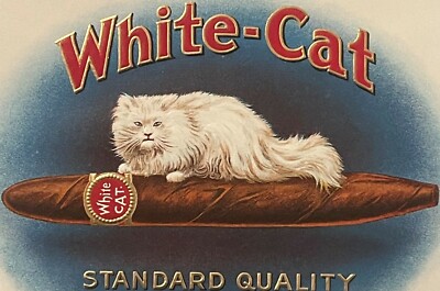
Cigar labels are small pieces of paper, but they rarely feel small. A good antique cigar label has the drama of a poster, the polish of a certificate, and the color impact of a theater program—all compressed into a format meant to sell a box of cigars from a shop shelf.
That visual power came from color lithography, the printing method that helped turn cigar packaging into one of the most collectible forms of advertising ephemera. Before modern digital printing, these labels required careful drawing, multiple color passes, precise registration, metallic effects, embossing, and an artist’s eye for what would catch a customer’s attention quickly.
This second post in our Cigar Bands & Labels series looks at the artistry behind the labels: how color lithography worked, why cigar labels became so visually rich, and what collectors should look for when judging quality.
What Is Color Lithography?
Lithography is a printing process based on the fact that oil and water do not mix. In traditional lithography, an image was drawn or prepared on a smooth stone or metal plate with a greasy medium. The printing surface was treated so ink would adhere to the image areas and be repelled by the non-image areas.
Color lithography, often called chromolithography, took that process further. Instead of printing a single image in black or one color, printers built a full-color image through multiple passes—one color at a time. Each color required careful planning so the layers would align properly.
For cigar labels, this mattered enormously. A label was not just “printed.” It was built in stages: background tones, figures, decorative borders, lettering, shading, metallic accents, and sometimes embossing.
That layered process is part of why antique labels can look so deep and rich today.
Why Cigar Labels Were Perfect for Chromolithography
Cigar makers needed packaging that stood out. A cigar box label had to do several jobs at once:
- Identify the brand
- Suggest quality and prestige
- Catch attention in a shop or saloon
- Make the product memorable
- Create a mood before the box was even opened
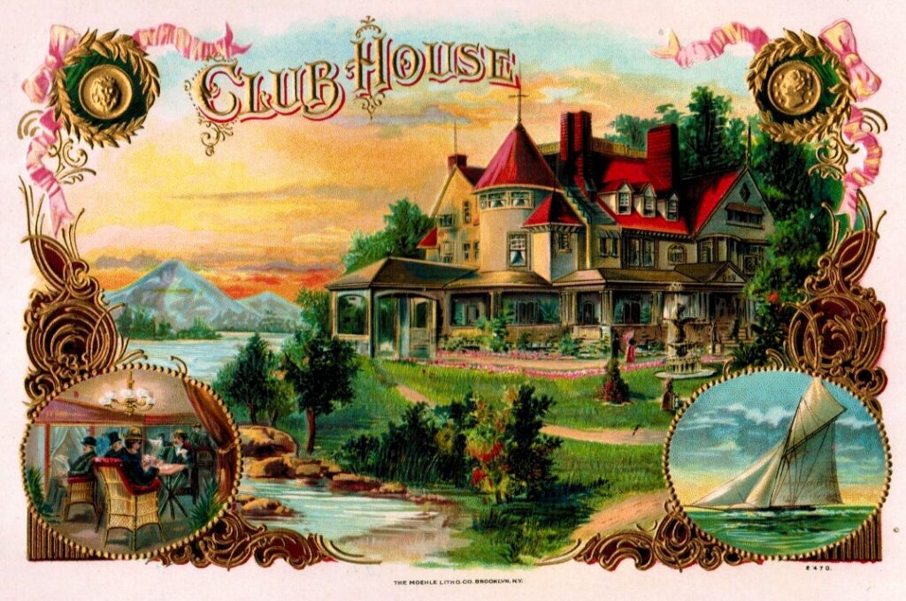
Color lithography was perfect for that. It allowed manufacturers to use rich reds, blues, greens, golds, flesh tones, shaded landscapes, ornate borders, and dramatic typography. The label could look luxurious even if it was mass-produced.
By the late 19th century, chromolithography had become an important advertising tool, and cigar manufacturers were among the businesses that used it with great enthusiasm. Their labels became miniature showcases for what commercial printing could do.
The Artist Behind the Advertisement
It is easy to think of cigar labels as “just packaging,” but many were designed with real artistic skill. The best labels balance several elements:
- A strong central image
- Clear brand lettering
- Decorative borders that frame rather than overwhelm
- Color harmony
- Shading and depth
- Visual hierarchy, so the eye knows where to look first
A successful cigar label had to be beautiful and practical. The customer needed to notice it, read the name, and remember the brand. That meant the artist could not simply create a pretty picture. The design had to work as advertising.
This is why cigar labels often feel so carefully composed. Portraits face the viewer. Medals and ribbons sit where the eye will catch them. Gold highlights emphasize the brand name or border. Tropical scenes create atmosphere without burying the lettering.
Good design was good salesmanship.
The Work of Registration: When Colors Line Up
One of the easiest ways to appreciate old color lithography is to look closely at the edges of the color areas. Because the image was printed in separate passes, the colors had to align—a challenge known as registration.
When registration is good, the image looks crisp:
- Faces have clear outlines and natural shading
- Lettering remains readable
- Borders line up cleanly
- Small decorative details feel sharp
When registration is slightly off, you may see color shadows or edges that drift. A little misregistration is common in older commercial printing and does not automatically ruin a label. But strong registration is a mark of quality, especially on highly detailed labels.
Collectors should pay attention to this. A label with clean registration, strong color, and crisp details often displays much better than one with muddy outlines.
Gold, Embossing, and the Illusion of Luxury
Many cigar labels used metallic effects to suggest quality. Gold was especially important because it immediately signaled richness, award-winning status, and prestige.
Collectors may see several kinds of visual enhancement:
Metallic inks and bronzing
Gold-colored effects could be added to lettering, borders, medals, seals, or decorative flourishes. These areas often catch light at an angle and give the label its “fancy” look.
Embossing
Embossing raises parts of the paper surface, giving the label texture. Raised medals, seals, crests, ribbons, or brand names make the label feel more expensive and more tactile.
Varnish and surface contrast
Some labels use finish contrast to draw attention. Glossy areas, metallic details, and matte printed zones can work together to create depth.
These effects were not merely decorative. They helped turn a cigar box into something that looked premium. A customer might not know the factory, tobacco blend, or maker—but they could see a label that looked impressive.
Progressive Proofs: A Window into the Process
One of the most fascinating parts of cigar label printing is the use of progressive proofs. These were printed stages showing how a design built up color by color. A proof might show one color pass, then another, then another, until the final label emerged.
For collectors and printing enthusiasts, progressive proofs are especially revealing. They show that the finished label was not a single image made all at once. It was a carefully coordinated sequence.
A progressive proof group can help collectors understand:
- Which colors were printed first
- How shading was layered
- Where metallic effects were added
- How much work went into the final image
- How printers checked alignment and color balance
Proofs and sample books are collectible in their own right because they preserve the working side of the trade, not just the final packaging.
Popular Artistic Styles and Visual Borrowing
Cigar labels borrowed freely from the visual culture around them. This is one reason they appeal to so many different collectors.
Fine art and portraiture
Some labels imitate painted portraits or formal engravings. Politicians, military figures, fashionable women, performers, and historical personalities could all become brand images.
Certificate and currency design
Ornate borders, shields, scrolls, ribbons, and medallions often resemble banknotes, diplomas, stock certificates, or awards. This gave labels an air of authority and legitimacy.
Travel and exotic imagery
Tropical landscapes, palm trees, ships, tobacco fields, and Cuban-inspired imagery helped create a sense of origin and romance. Even when the branding was more fantasy than documentation, the image sold atmosphere.
Theater and poster design
Bold figures, strong color blocks, and dramatic titles helped labels compete visually. A box label had to make an impression quickly, much like a poster.
Political and patriotic imagery
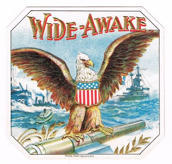
Flags, eagles, presidents, Capitol scenes, and military references tied products to public pride, current events, or recognizable figures.
The artistry was rarely neutral. It was designed to persuade.
The Smaller Challenge: Cigar Bands
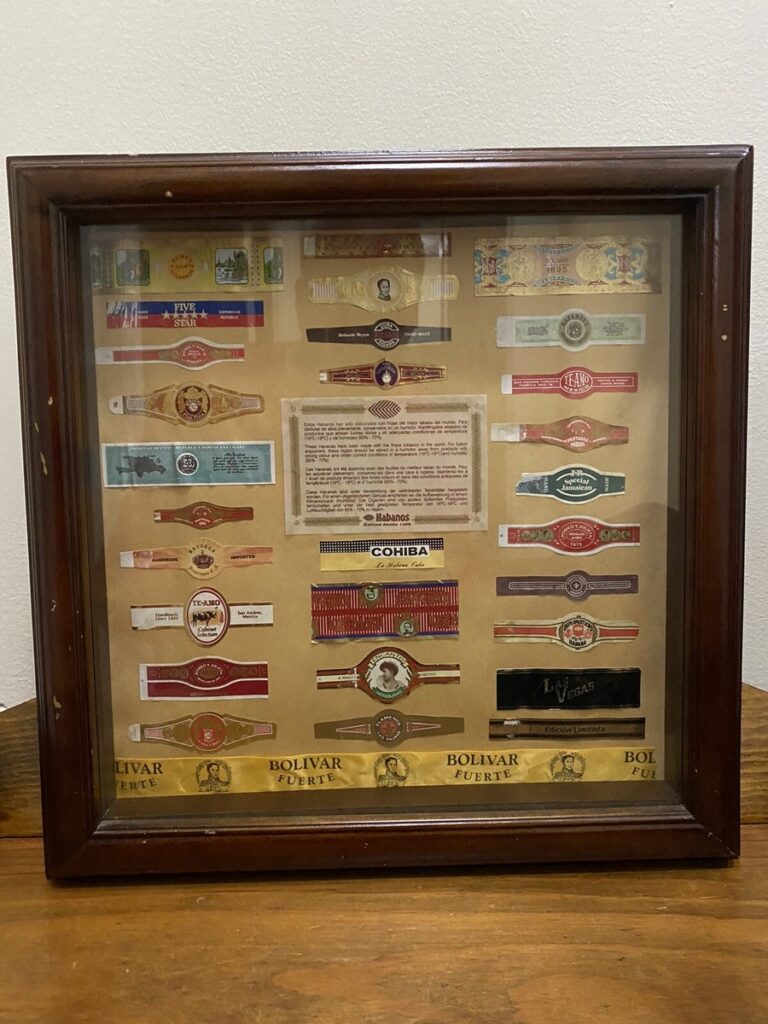
Cigar bands used many of the same artistic ideas, but in miniature. A band had very little space to carry a brand identity, so the design had to be compact and legible.
A strong cigar band might include:
- A central brand name
- A small crest, portrait, or monogram
- Metallic trim
- Bright color contrast
- Symmetrical scrollwork or borders
Collectors often enjoy bands because they feel like tiny jewels of paper design. But their small scale also makes condition especially important. A split end, missing edge, or heavy glue stain can interrupt the whole design.
What Collectors Look For in Lithographed Labels
When evaluating a color lithographed cigar label, collectors often focus on both artistry and condition.
Color strength
Bright, unfaded color is one of the biggest visual draws. Reds, blues, greens, and golds should still feel lively. Fading can flatten the design and reduce display appeal.
Registration and detail
Look closely at faces, lettering, borders, and small ornaments. Crisp alignment and fine detail usually signal stronger printing quality.
Metallic and embossed areas
Gold and embossing should still be visible and appealing. Rubbed metallic areas are common, but heavy abrasion can diminish the label’s impact.
Subject matter
Collectors often chase certain themes: women, animals, ships, patriotic scenes, political figures, factories, tropical landscapes, or local/regional brands.
Completeness
Borders matter. A label that has been trimmed, cut down, or torn at the corners may lose much of its design balance.
Back condition and mounting
Labels removed from boxes, scrapbooks, or sample books can have glue residue, thinning, or paper loss on the back. Always ask about mounting if the back is not shown.
Common Condition Problems in Color Lithographed Labels
Because cigar labels are paper objects, time leaves marks. Some wear is expected, but certain issues matter more than others.
Watch for:
- Faded color from sunlight
- Rubbed gold or flattened embossing
- Tears through central images or brand names
- Missing corners or trimmed margins
- Foxing or brown spotting
- Water stains
- Glue residue from box removal
- Scrapbook mounting damage
- Creases across faces or lettering
- Abrasion from handling
With labels still attached to boxes, inspect the hinge area and lid interior. Opening and closing the box can stress the paper over time.
Displaying Lithographed Labels as Art
Cigar labels are among the easiest paper collectibles to display because they are colorful, graphic, and immediately readable. They work beautifully in grouped arrangements.
Display ideas:
- Frame a single strong label as a miniature poster
- Group labels by theme, such as ships, women, or patriotic imagery
- Display cigar bands in rows to emphasize their jewel-like scale
- Keep proof sheets or sample pages in archival sleeves for study
- Pair a label with its matching cigar box when available
Use acid-free materials and UV-protective glass if framing. Avoid direct sunlight, which can fade the same colors that make the label desirable.
If a label is still attached to its original box, think carefully before removing it. The full box may tell a richer story than the label alone.
Why the Art Still Works
The best cigar labels still do exactly what they were designed to do: stop the eye. They are colorful, dramatic, and confident. Even removed from their original commercial setting, they remain persuasive as design.
For collectors, that is the lasting appeal of color lithography. These labels were made for commerce, but they survived as art. They show the moment when printing technology, advertising ambition, and visual imagination all came together on a piece of paper small enough to fit inside a box lid.
Next in the series, we’ll look at what happened when people started saving and trading these little printed showpieces: Cigar Label Collecting Craze (1890–1920).
Let’s Make History—one color pass at a time.
Looking for something related?
Dear June Collectibles carries thousands of antiques, vintage pieces, collectibles, ephemera, books, housewares, jewelry, memorabilia, and unusual finds. Inventory changes constantly.
Found something like this while clearing a home or collection?
Before assuming it should be thrown away, tell us what you found. Dear June Collectibles helps families, collectors, executors, and homeowners sort household contents, collections, and estates and identify realistic resale possibilities.