There’s a funny little moment most of us don’t notice until it’s pointed out: when we’re in a new town, we instinctively tilt our heads up.
We look up for the diner name painted on brick. For the old motel blade sign that still hangs on, stubborn as ever. For the glow that says “OPEN” even when the street is quiet. We look up because signs are how places introduce themselves. They’re how businesses speak across decades. And—whether we mean to or not—they’re how we decide what feels familiar, what feels trustworthy, and what feels like it’s worth stopping for.
This post is a wrap-up of our Signs series, but it’s also a love letter to the whole reason collectors chase these pieces in the first place. Not just because signs are cool (they are), or because they photograph well (they do), but because signs sit right at the intersection of art, commerce, technology, and everyday memory. They’re practical objects that somehow became emotional ones.
Signs are public storytelling
A good sign does two jobs at once:
- It tells you what you need to know (where you are, what’s being sold, what’s open, what’s ahead).
- It tells you how it wants to be remembered (modern, classy, playful, trustworthy, thrilling).
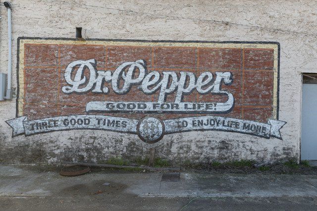
That second job is why signs feel so personal—even when they were made for the masses. A porcelain gas sign doesn’t just say “GAS.” It says road trip, service station bell ding, a uniformed attendant, a certain kind of American optimism. A hand-painted shop sign doesn’t just name a business. It shows the owner’s taste, the town’s pace, and the era’s design language in one glance.
And unlike a lot of antiques, signs were built to be seen quickly. That means they often exaggerate the very things we now love most: bold typography, high-contrast colors, simplified icons, and slogans that stick in your head.
We look up because signs were built for our attention
Long before we carried glowing rectangles in our pockets, the world was already full of “feeds.” Streetscapes were layered with messages: storefront lettering, street signs, theater marquees, painted wall ads, window decals, billboards.
Signs trained us to scan. To spot meaning fast. To read a block of color as information.
That’s why signs still work on us today—even the old ones. Your brain doesn’t need context to understand a big arrow, a crisp logo, or a bright border. The design does what it was always meant to do: cut through visual noise and lodge itself in memory.
It’s also why you can walk into an antique mall, glance across a room, and instantly feel pulled toward a certain piece on the wall. The best signs don’t politely wait to be appreciated. They perform.
Materials matter because they carry the era inside them
One of the quiet joys of sign collecting is realizing you’re not just buying an image—you’re buying a manufacturing story.
Different sign types rose because of what industry could do at the time:
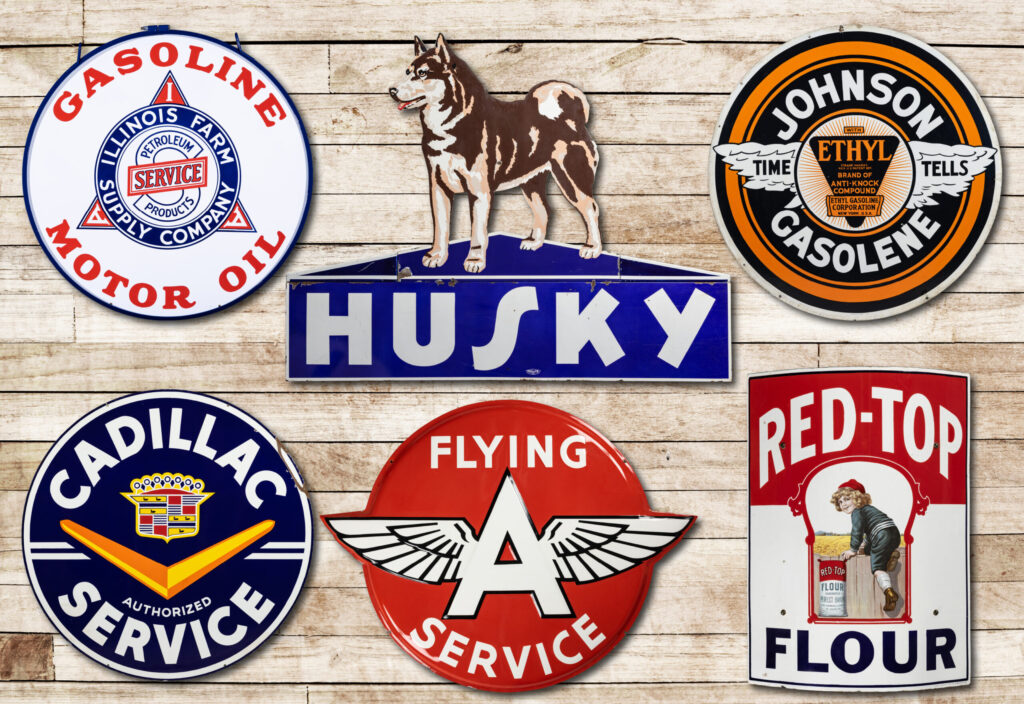
Porcelain enamel: color that refuses to quit
Porcelain (vitreous) enamel signs earned their reputation for a reason. That glassy surface holds color beautifully and stands up to weather in a way that feels almost unfair. When you see that deep shine, you’re seeing a moment when durability was part of the sales pitch—and when companies expected their branding to live outdoors for years.
Collectors love them because the material itself feels confident. Even with chips and edge wear, a great porcelain sign still commands a wall.
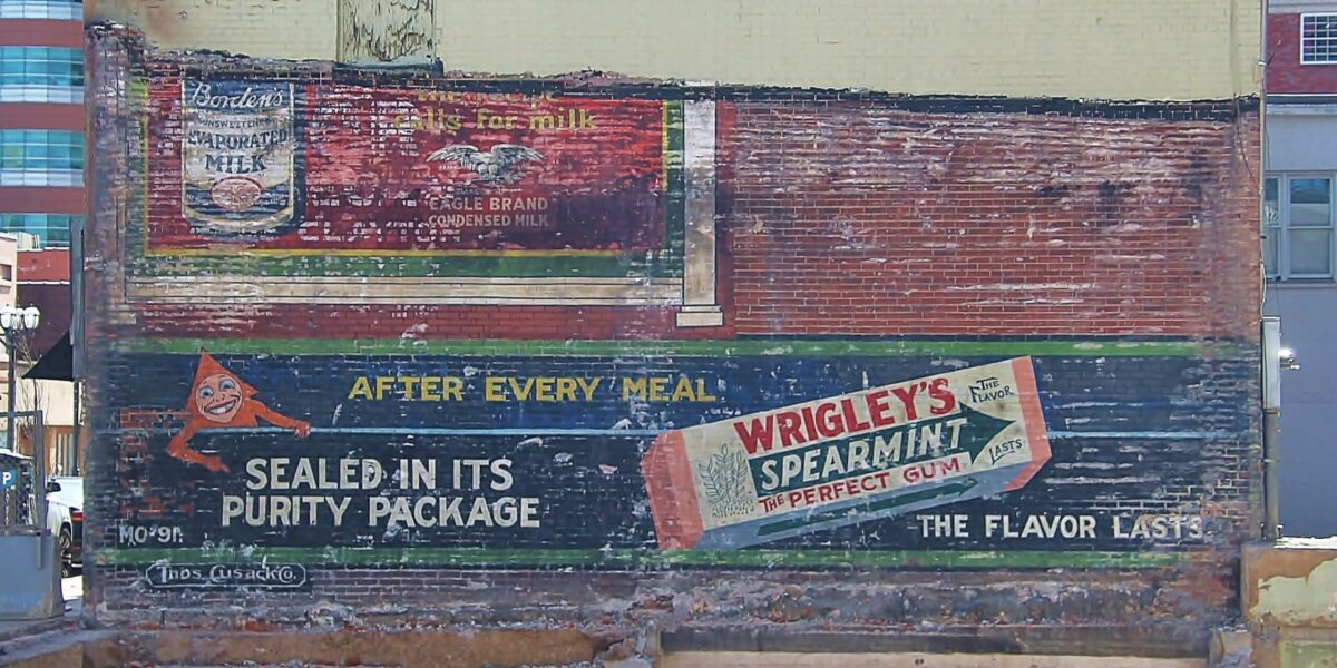
Tin & lithographed metal: the age of mass advertising
Tin and lithographed metal signs tell a different story: the story of scale. As printing and production got faster, advertising got louder—and more consistent. Logos standardized. Package designs became recognizable from a distance. Color palettes started to “belong” to certain brands.
Tin signs are also where you can really watch typography trends change decade by decade. They’re time capsules in fonts.
Neon and lighted signs: the moment advertising learned to glow
When signage started to light up, it didn’t just extend business hours—it changed the emotional temperature of a street. Lighted signs made cities feel electric and highways feel less lonely. Neon in particular became shorthand for modernity, nightlife, and the thrill of being “on the move.”
And even if you’re not collecting neon itself, the influence shows up everywhere: bold letterforms, bright outlines, dramatic contrasts meant to be readable at speed.
Plastic, acrylic, and backlit faces: clean, bright, and very “mid-century”
As materials evolved, signage got lighter, sleeker, and more modular. This is where you start seeing the visual language of diners, bowling alleys, and shopping strips—clean lines, playful shapes, and a kind of optimism that feels baked into the material.
If porcelain is “built like a tank,” and tin is “built to circulate,” then mid-century plastics are “built for a bright future.”
The roadside made signs iconic
A sign in a walkable downtown works differently than a sign meant to be read at 45–70 mph.
Once travel culture shifted—first with rail lines and streetcars, then with automobiles and highways—signage became a competitive sport. Businesses weren’t just trying to identify themselves. They were trying to win the stop.
That’s how we got the classics:
- Oversized brand logos on tall poles
- Arrow signs and directional boards
- Motels and diners with bold, friendly naming
- Big promises in a few words (“ICE COLD,” “EAT,” “VACANCY”)
And that’s also where the tension begins—because as signage grew, so did the backlash. People have argued for more than a century about what signs do to a landscape: whether they’re exciting, ugly, necessary, cluttered, charming, or all of the above.
That debate matters to collectors because it explains why so many signs disappeared. Regulations, redevelopment, changing tastes, corporate rebrands, and simple wear-and-tear all did their part. Surviving examples—especially large-format pieces—often made it through multiple “clean-up” eras.
We look up to signs because we trust what looks well-made
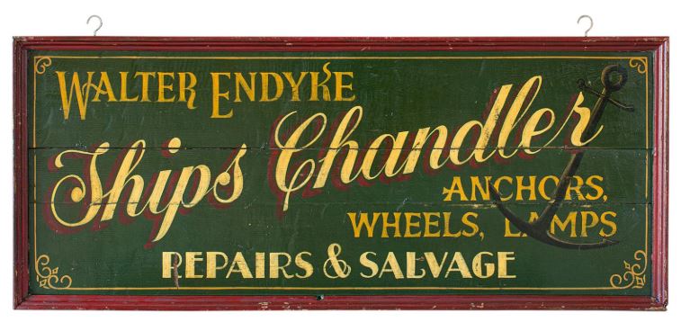
Here’s a collector truth that applies far beyond signs: craftsmanship reads as credibility.
Even when we don’t know the brand, we can feel quality. A thick gauge of metal. Crisp edges. Confident color. Professional layout. The object tells us it came from a business that invested in being seen.
That’s why authentic vintage signs have a presence that reproductions struggle to imitate. It’s not just “age.” It’s the way real-world use shows up:
- Mounting holes that make sense for how it would have hung
- Fading that’s uneven (sun and weather aren’t consistent)
- Wear concentrated at edges, corners, and contact points
- Patina that looks lived-in rather than manufactured
And it’s also why condition matters so much in this category. With signs, damage isn’t just damage—it’s part of the design story. A dramatic porcelain chip can be character. But heavy rust-through can erase the very graphic elements that made the sign special.
What we learned in this series: a collector’s wrap-up checklist
Whether you collect porcelain, tin, neon, store displays, or a little bit of everything, these are the “big picture” takeaways that tend to hold true.
1) Buy what you’d stop for on the road
If a sign makes you pause—really pause—it’s doing its job. Great signs are emotional. They don’t need you to justify them.
2) Prioritize graphics over trends
Hot brands come and go. But strong design stays strong. If the typography and layout are excellent, the sign will still feel right years from now.
3) Learn the reproduction tells (and don’t panic—just verify)
Reproductions exist in every sign category, and that’s not automatically a bad thing—unless someone is trying to sell one as vintage. Common sense checks help:
- Does the wear look natural or staged?
- Are the colors and printing too “perfect” for the supposed age?
- Does the construction match what you’d expect from the era?
- Are there modern mounting systems, barcodes, or modern materials?
If you’re unsure, it’s okay to walk away. Another sign will come along.
4) Condition is part of value, but it’s not the whole story
Some collectors want near-mint pieces. Some want honest wear. Most of us fall somewhere in between. The trick is knowing what kind of damage you can live with—and what will bother you every time you see it on the wall.
5) Display is half the fun
Signs are meant to be seen. And you don’t need a themed basement bar to enjoy them.
A few easy, collector-friendly display ideas:
- Layered wall: mix one large sign with smaller “supporting cast” pieces (tags, small tins, framed paper ads)
- Kitchen or pantry: bakery, dairy, soda, coffee, spices
- Hallway gallery: one sign per “stop” like a mini roadside route
- Shelf leaners: smaller signs leaned against a wall so you can rotate them seasonally
- Conversation corner: pair a sign with an object it advertised (an old oil can, a product tin, a crate label)
Why signs feel like home, even when they’re not “ours”
A lot of antiques are intimate: jewelry, furniture, photographs, letters. Signs are the opposite. They’re public. They belonged to everyone who passed by.
And yet they can hit us right in the chest.
That’s because signs are memory anchors. They connect to routines: the place your family stopped on trips, the corner store you walked to, the diner you always said you’d try again, the gas brand you remember from childhood.
In a world where branding changes fast—logos update, storefronts refresh, buildings get torn down—old signs keep a place stable. Even if the business is gone, the sign proves it existed. It’s a witness.
That’s why we look up to signs. Not just because they’re above eye level, but because they’re above the ordinary. They turn a street into a story.
Closing thoughts: collecting as preservation
Every sign you save—whether it’s a big porcelain oil piece, a humble tin door push, or a glowing fragment of neon history—is a small act of preservation. You’re keeping design alive, local commerce visible, and the roadside imagination intact.
And if this series has done its job, I hope the next time you’re out driving—whether it’s down a main street or past a tired strip mall—you’ll catch yourself doing it again.
Looking up.
“Let’s Make History—one sign at a time.”