
If “The Birth of Carnival Glass” is the origin story, then patterns and colors are the language collectors actually speak. When you hear someone describe a piece as “marigold in a grape pattern” or “amethyst peacock,” they’re not just naming what it looks like—they’re placing it inside a whole ecosystem of makers, molds, finishes, and display styles.
Carnival glass can feel overwhelming at first because there’s so much of it: thousands of patterns, dozens of base colors, and endless variations created by different factories and different production runs. The good news is that you don’t have to know everything to collect well. You just need a few reliable ways to see carnival glass: how to spot the base color, how to recognize pattern families, and how to describe what you’re holding in a collector-friendly way.
This post is your practical guide to the most popular patterns and the most common color families—and how the two work together to create that signature “oil-slick rainbow” look we all chase.
How Collectors Describe Carnival Glass (A Simple Formula)
Most collector descriptions follow a pattern like this:
Maker (if known) + Pattern Name + Form + Base Color
So you might see:
- “Grape pattern ruffled bowl in marigold”
- “Peacock pattern compote in amethyst”
- “Open rose pattern plate in smoke”
Two key points make this easier:
- Color usually refers to the base glass, not the rainbow surface. The iridescence rides on top.
- Pattern names are collector shorthand. Factories often used their own catalog names (or none at all), and collectors later standardized names to identify molds and designs.
If you’re new, don’t worry about getting every label perfect. Start with what you can see: pattern family, base color, and shape.
Color 101: Base Glass vs. Iridescent Finish
Carnival glass is famous for its shimmer, but collectors categorize it by the underlying glass color—what you can usually see best on the underside, rim, or any area where the iridescence is lighter.
Marigold: the classic “carnival” look
Marigold is the color most people picture first: a warm gold-orange glow with rainbow highlights. In many cases, marigold begins as clear glass and gets its color effect primarily from the iridescent spray. That’s why marigold pieces can look like they’re lit from within.
Collector shortcut: If you’re uncertain, flip the piece over and look at the base. Marigold often reads “clear-to-amber” underneath with a strong golden surface.
Purple/Amethyst: rich and dramatic
Amethyst carnival glass has a deep, jewel-like feel. It can make patterns look sharper and more sculptural because the darker base color creates strong contrast under the sheen.
Why collectors love it: It often photographs beautifully and displays well under both lamp light and daylight.
Blue: from bold cobalt to softer “ice” tones
Blue carnival glass spans a wide range. Some blues feel saturated and bold; others feel airy and pastel. In display, blue pieces can look “cooler” and more iridescent because the surface highlights often shift toward teal and violet.
Collector note: Some of the most striking blue pieces are the ones where the iridescence is even and strong across the highest pattern points.
Green: emerald to pale green
Green is another staple color family. Deep greens feel lush and vintage; paler greens can look almost luminous, especially when the iridescence flashes gold and pink on top.
Collector tip: Green can be especially flattering in patterns with leaves, vines, and floral relief—because the base color reinforces the motif.
Amber and smoke: warm neutrals
Amber carnival glass can read honeyed and antique, while “smoke” tones can look moody and sophisticated. These neutrals are popular with collectors who like carnival glass but want a palette that feels slightly more subdued.
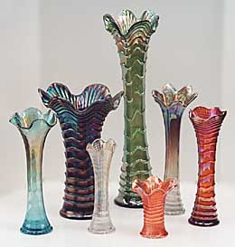
White and opalescent effects: light-catching and sculptural
Some carnival glass uses a white base (often described as milk-glass-like), while others show opalescent qualities—edges that glow lighter or shift tone. These pieces tend to feel very “decorative-object” even when they’re technically tableware.
Collector note: Light base colors make pattern relief stand out strongly, especially on bold designs with deep texture.
A word about “rare” colors
It’s tempting to label colors as rare across the board, but color scarcity varies by maker, pattern, and shape. A color that’s hard to find in one pattern may be more available in another. A safer collector mindset is: “less commonly seen” rather than “rare,” unless you’re working from a specialized reference.
The Big Pattern Families: What You’ll See Most Often
Pattern names can get wonderfully specific, but most designs fall into a few big, recognizable families. Learning these families is the fastest way to start identifying pieces confidently.
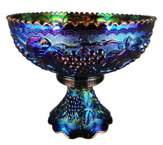
Grapes, Vines, and Garden Abundance
If carnival glass had a “classic” theme, it might be grapes. Grape clusters, vine leaves, and fruit-laden borders show up across many popular patterns because they look fantastic in pressed relief. The raised grapes catch iridescence on every curve, which makes the pattern sparkle even from across a room.
What to look for:
- rounded grape clusters repeated in bands
- curling vine leaves
- rope-like borders, basketweave exteriors, or textured backgrounds
Collector-friendly appeal: Grape patterns tend to be very displayable—bowls and plates look rich and dimensional even in common colors like marigold.
Peacocks: Showy, Architectural, and Instantly Recognizable
Peacock patterns are favorites for a reason: the feathers create natural fan shapes that are perfect for pressed glass. Peacock motifs often pair well with fountain, floral, or scroll elements, giving the design a “centerpiece” feel.
What to look for:
- fan-like feather spreads
- dramatic symmetry
- strong central focal points (often a bird or fountain element)
Collector note: Some well-known peacock patterns were made by more than one company, so you may see close cousins or variants across makers.
Butterflies and Berry Motifs: Delicate, Lively, and Popular on Sets
Butterflies, berries, and leafy borders are a sweet spot in carnival design: they’re detailed enough to feel special, but still readable and charming. These motifs show up frequently on table sets—pitchers, tumblers, sugars, creams, and serving bowls—because they translate well to functional forms.
What to look for:
- butterflies in repeating panels
- berry clusters or bead-like borders
- leafy framing and gentle pattern rhythm
Collector appeal: This family often looks great in multiple colors, which makes it fun to collect as “same pattern, different color” without feeling repetitive.
Roses and High-Relief Florals: Soft Shapes with Strong Shine
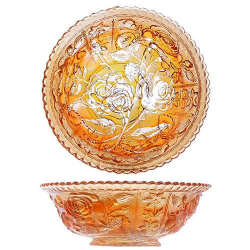
Roses, buds, and large floral sprays show up in many carnival patterns. In pressed glass, floral relief can look almost sculptural, especially when the background is textured and the petals sit high on the surface.
What to look for:
- large blooms in high relief
- repeating buds and leaves
- textured background fields (stippling or patterned fill)
Collector note: Rose patterns can look surprisingly different depending on the rim shape. A ruffled edge can make a floral bowl look romantic; a flatter rim can make it feel more formal.
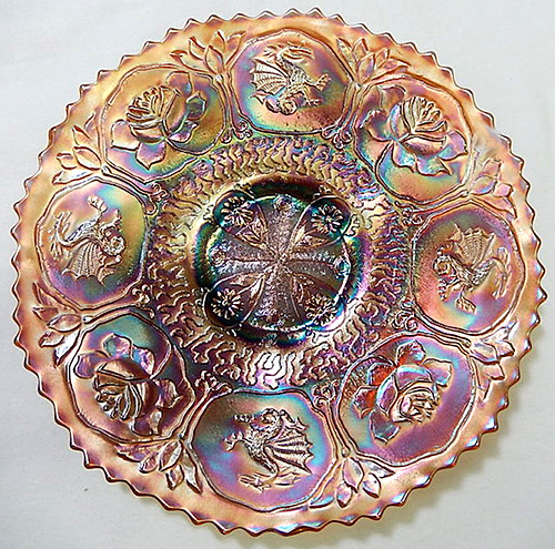
“Exotic” and Story Patterns: Dragons, Medallions, and Bold Motifs
Some carnival patterns lean into dramatic imagery: dragons, medallions, heavy scrollwork, or motifs that feel influenced by Eastern design trends popular in the early 1900s. These pieces often have strong visual impact because the pattern reads like illustration.
What to look for:
- large central medallions
- repeating scroll borders
- bold figures or creature motifs
- lots of linework and texture in the relief
Collector appeal: These designs tend to be conversation pieces. Even one plate or bowl can anchor a shelf display.
Geometric and “Fan” Patterns: Clean, Graphic, and Highly Reflective
Not all carnival patterns are botanical or figurative. Many are geometric: fans, rays, ribs, diamonds, stars, and repeating architectural elements. These patterns can be especially brilliant under light because the facets behave like mirrors.
What to look for:
- radiating fan shapes
- repeated ribs or ray patterns
- starburst centers
- clean symmetry with fewer “picture” elements
Collector tip: Geometric designs are great if you like carnival glass in a more modern-looking display. They read as graphic and intentional.
How Color and Pattern Change Each Other
One of the joys of carnival glass is that the same pattern can feel like a completely different piece when the base color changes.
A few collector observations that are consistently useful:
- Marigold highlights the relief—great for showing off texture and bold motifs.
- Amethyst and deep colors add drama—patterns look sharper and more sculptural.
- Blue often emphasizes “peacock” effects—teal and violet flashes can feel especially vibrant.
- Light bases (white/opalescent looks) make patterns feel crisp—great for florals and fine detail.
Also remember that iridescence isn’t always evenly applied. Two bowls from the same mold can differ in how “hot” the sheen looks. That variation is normal, and many collectors enjoy it as part of the hunt.
Quick Identification Tips (Without Getting Overwhelmed)
If you’re trying to identify a pattern from photos or in the wild, use a simple order of operations:
1) Identify the pattern family first
Ask: grapes, peacock, floral, butterfly/berry, geometric, or “story” motif?
2) Note the shape and rim
Ruffled, crimped, flared, footed, or flat? Rim treatment can narrow down matches quickly.
3) Check interior vs. exterior
Some pieces have different patterns inside and outside. Turn the piece and look at both surfaces.
4) Look for maker marks (but don’t rely on them)
Some carnival glass is marked; much is not. A mark can help, but a lack of mark doesn’t rule anything out.
5) Compare one strong detail
Instead of trying to match the entire design at once, pick one bold detail—like a feather fan, a specific grape cluster shape, or a rose-and-bud arrangement—and match that.
Building a Collection Around Patterns and Colors
If you want a collection that feels cohesive, choose one “anchor” and let it guide you:
- One pattern across many colors (great for visual comparison)
- One color across many patterns (a strong display theme)
- One motif family (peacocks, grapes, roses, etc.)
- One form type (compotes, plates, vases, water sets)
Carnival glass rewards focus. A shelf full of random pieces can look busy, but a shelf that repeats a theme—same pattern family or same color family—looks curated and intentional.
And if you’re collecting for pure joy? Follow the glow. The right piece is usually the one you keep turning in your hands because it won’t stop flashing.
Let’s Make History—one pattern and color at a time.